The Metropolitan Museum of Art Data Visualization Project
This is a Data Visualization project using collection data from the Metropolitan Museum of Art. It uses Python, Pandas, Numpy, Plotly, and Dash.
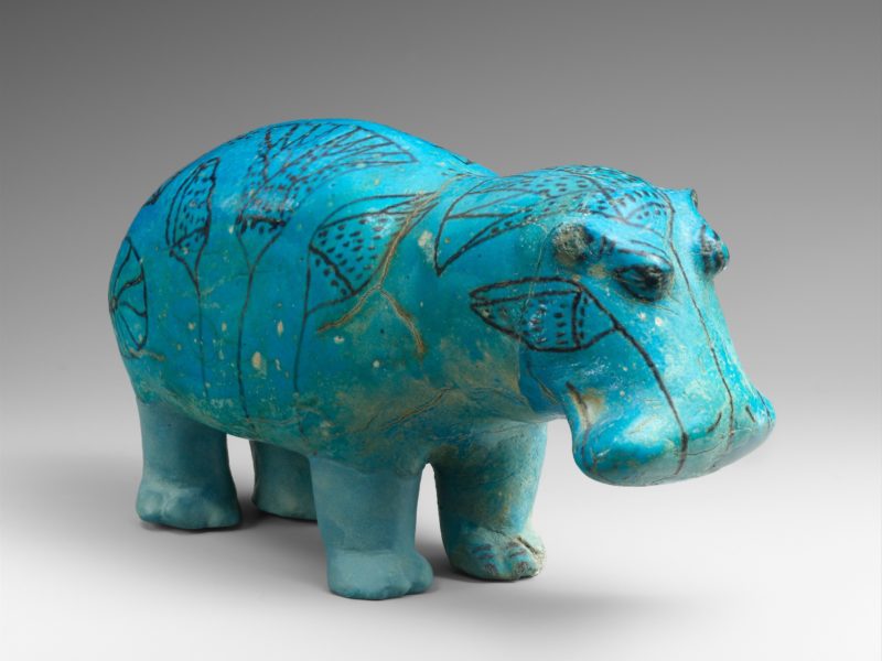
This is a Data Visualization project using collection data from the Metropolitan Museum of Art. It uses Python, Pandas, Numpy, Plotly, and Dash.
I like museums and I am always curious about their collections. I want to know what kinds of artifacts the museum has, where the artifacts are from, when they were acquired, and so forth. To create a data visualization project I decided to use data from the Metropolitan Museum of Art in order to answer some of these questions.
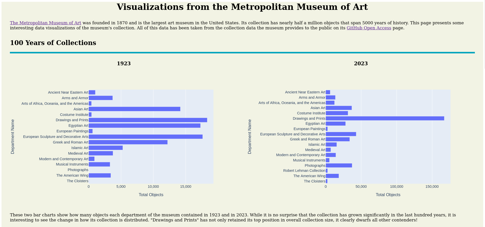
While originally I planned to use the museum’s API, the interface did not allow for the easy collection of the data I was interested in. Therefore, I pivoted to using the CSV file the museum provided instead. This allowed me to learn how to use Pandas to create DataFrames that contain only the data needed for each visualization, which is much more efficient than working with the entire database at once.
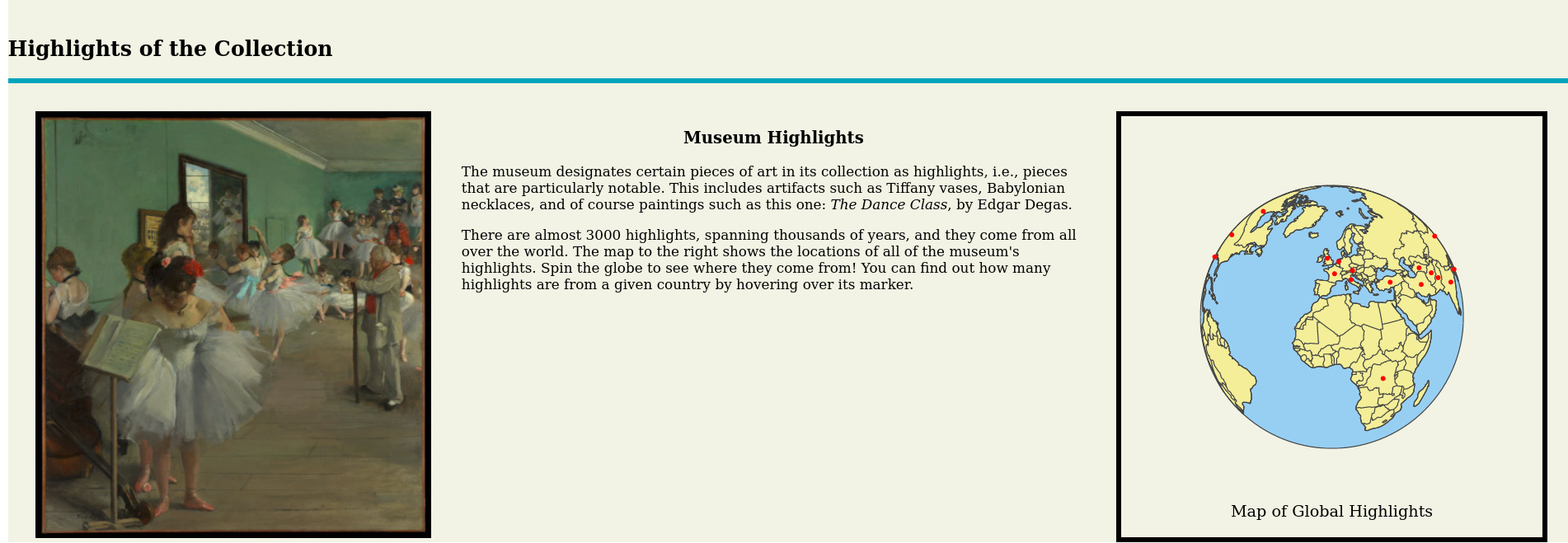
Unfortunately some of the data required a lot of cleaning. For instance, there is no ISO standard for “France (probably)” or “New Spain.” Similarly, the year of acquisition was sometimes missing. The former I could clean up by hand, and for the latter I used Numpy to represent the lack of data in a format that was easy to work with.
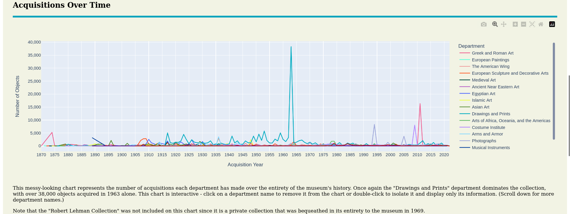
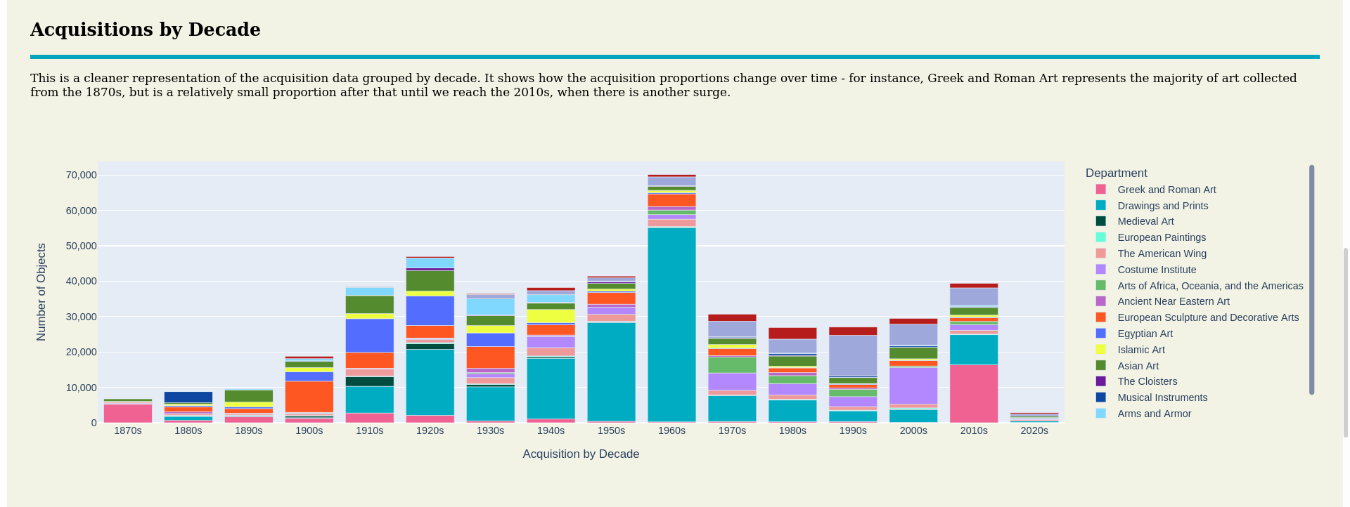
To create the data visualizations I used Plotly. While this creates beautiful visualizations, it also has some annoying limitations, such as being unable to control what order the departments are listed in on a particular chart. While this is not concerning for a single chart, it unfortunately means that there can be inconsistency between charts, as you can see by comparing the line and stacked bar charts above.
In order to put all of the visualizations into a single web page I used Dash, along with a little HTML and CSS to clean things up a bit.